In honor of Global Accessibility Awareness Day, The Arboretum invites you to an inspiring event dedicated to digital inclusivity. Experience a thought-provoking panel discussion with accessibility leaders as we highlight the importance of digital inclusivity and learn how to create content from the heart that celebrates diversity and embraces every voice.

If you missed this event, watch the recording now:


Learn more about our speakers for Elevate Your Impact: Fostering Inclusion through Content, A Global Accessibility Awareness Day Event!


Meet our panelists:
 

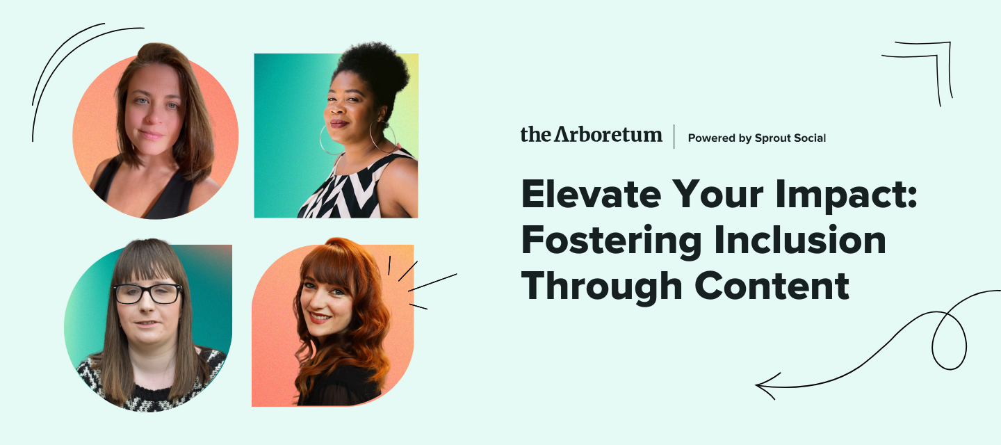
A promotional graphic showcasing Holly Tuke’s headshot overlaid on a green gradient shape

Holly Tuke (She/Her) is a social media professional, blogger, freelance writer, and disability advocate. She’s a Social Media Officer for RNIB (Royal National Institute of Blind People) and the author of the award-winning blog Life of a Blind Girl. Holly is passionate about encouraging people to make their social media content accessible and share her lived experience of disability to raise awareness and educate others.


A promotional graphic showcasing Keidra Chaney’s headshot on a green and yellow gradient shape


As a digital communications professional, plain language writer, trainer, and mentor, Keidra Chaney (She/Her) endeavors to create equitable online communities and content for marginalized people. Over the past two decades, Keidra has established herself as a leader in communications and digital strategy, having lived experience as a person with disabilities. Keidra currently is a 2024 Fellow at the Longmore Institute for Disability at San Francisco State University. Previously she was a 2020 Fellow with Disability Lead, the only program in the country for emerging leaders with disabilities, and a 2021 member of the Borealis Philanthropy Disability Inclusion Fund Advisory Committee. She is also a Certified Professional in Accessibility Core Competencies (CPACC).


A promotional graphic showcasing Caroline Desrosiers’s headshot on an orange gradient shape

Caroline Desrosiers (She/Her) is a digital accessibility advocate, speaker, writer, consultant, and founder of Scribely, a 100% woman-owned media agency on a mission to make images, videos, and audio accessible and inclusive to all humans. Scribely provides accessible media production, training, and consulting services for leading organizations and providers in eCommerce, education, and cultural heritage.


Hosted by:
 

A promotional graphic showcasing Caitlin Grogan’s headshot on an teal gradient shape


What a stellar panel. Can’t wait for the event and to learn more about implementing digital inclusivity.

@AlexaHeinrich@kristen.franca, @amanda.lor, @lisa.rodrigo, @CarmenCollins - looking forward to seeing y’all there!


Post an image and its corresponding description that is personally significant to you in the thread below. As we all add to this collection of image descriptions and alt text examples, we will support one another by providing examples to browse when experiencing writer's block, uncertainty, or discomfort. By sharing as a group, we are making a more significant impact on the change needed in our industry.

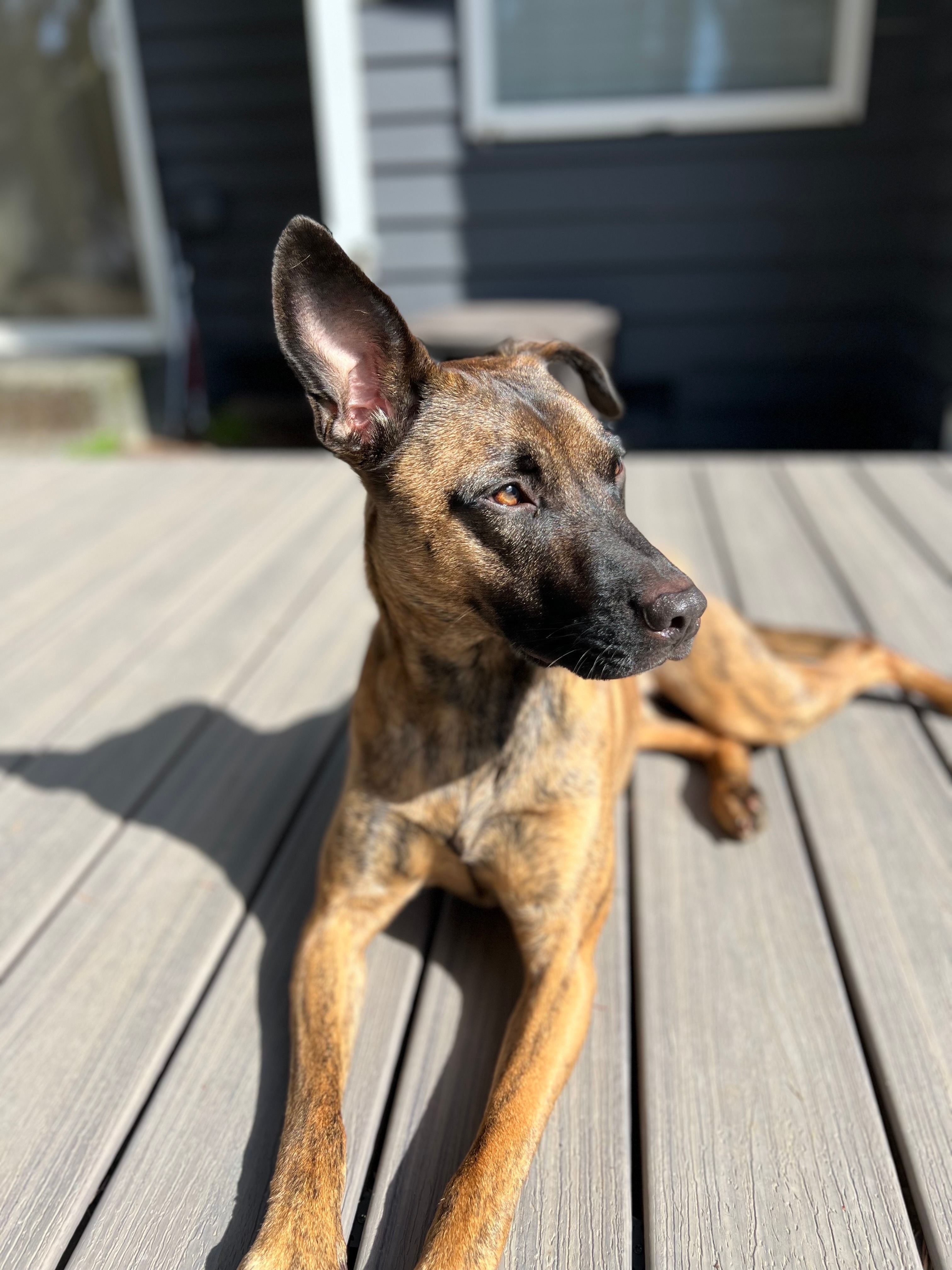
Here’s an example to get this thread started:


Image description: A brown and black dog is lying on a wooden deck, bathed in warm sunlight. The dog's fur gleams in the sunlight in shades of rich brown and deep black. One ear is perked up as she listens to the sounds of nature.


Wonderful webinar as always, Laura! Loved how engaged everyone attending was!


This was a fantastic webinar! Thank you to Sprout for hosting and the panelists for sharing their valuable experience and insights. I learned so much and can’t wait to share with the rest of my team. 


I had two follow-up questions:

  1. What would you consider the most accessibility-friendly social platform? (ease of use, alt text capabilities, etc.)
  2. Can anyone recommend a free social accessibility certification or course?

Hi @Anna Laura McGranahan, thank you so much for attending! I added your first question to my notes for sharing in the recap a little later today.

My favorite resource for learning about accessibility is @AlexaHeinrich’s website Accessible Social. Maybe you could make a course too, Alex. This might be wishful thinking, haha. 


If you missed today’s inspiring event, catch up now. If you attended, revisit your favorite moments in the video below!


There were quite a few questions we weren’t able to answer live. I’m still working on those and will follow up shortly!

Here are some of the resources we shared today:


If you would like to receive the images with descriptions or the slide deck via email, please send a DM to Laura Porcincula.


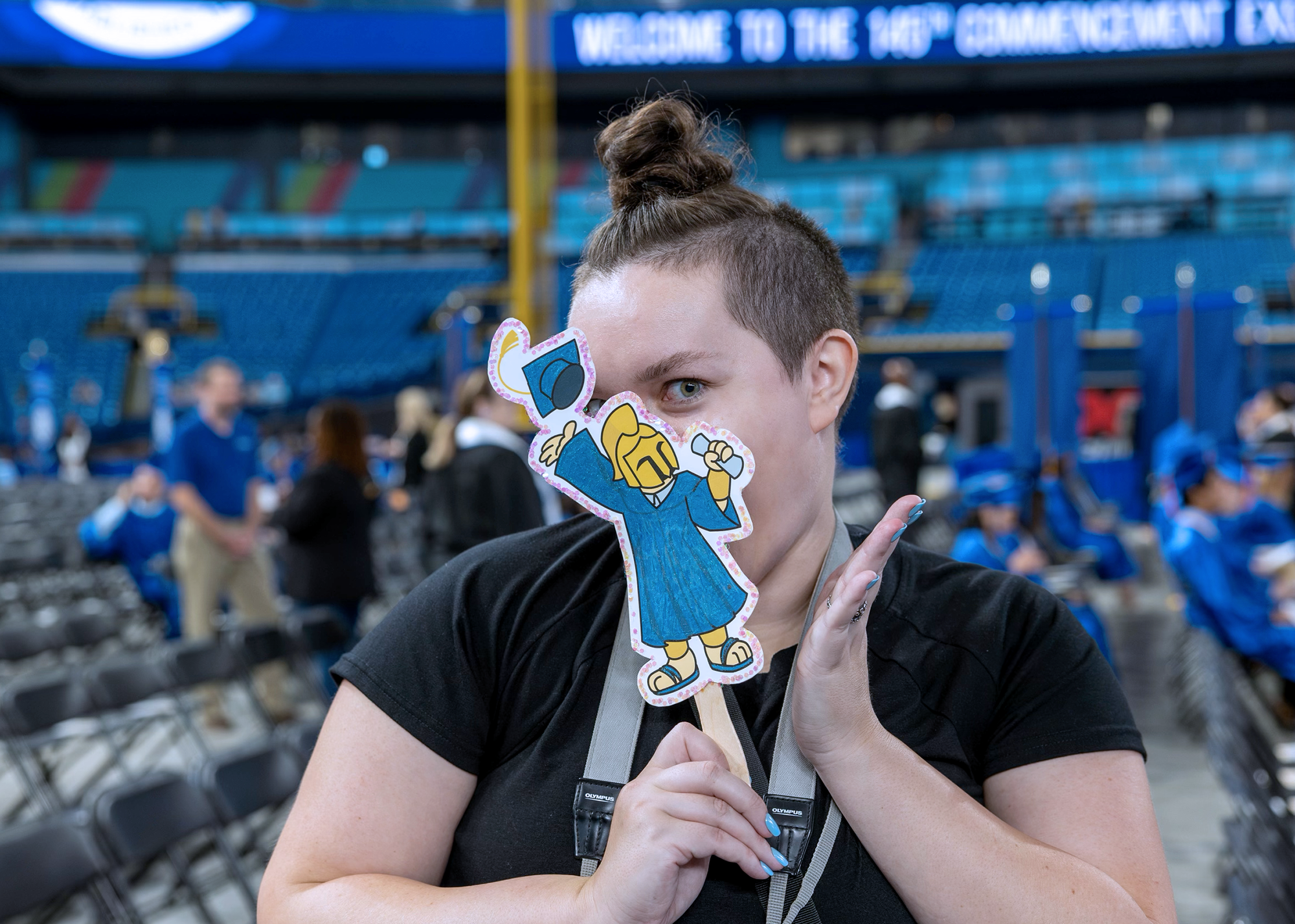
My contribution to the alt text writing activity: a picture of me at my last graduation ceremony with St. Petersburg College.

Image Description: Alexa holding up a paper cutout of a gladiator mascot wearing a blue graduation cap and gown. It partially obscures her face.


I enjoyed the webinar. My favorite part was getting to hear from people with experience using accessibility tools, as their perspectives are invaluable. I was a little unclear about: 

  1. Do you include ethnicity when writing alt text? What about gender? 

For me, I like being able to showcase that we have a diverse group of students and staff, but I am always cautious because I don’t want to misidentify someone, come across as bias, or offend someone. 

People seem to have radically different views about whether this is appropriate. What does the arboretum community think?


Super insightful webinar! While I was familiar with accessibility tools for digital and social media, my new role as communications officer at Sightsavers Ireland has deepened my understanding of accessibility, and this webinar definitely helped. Thank you, Holly, Keidra, Caroline and of course Caitlin for such a stellar hour!


There were some questions we weren’t able to get to in our session, here they are answered by our panelists below.

Anonymous: Do you have guidance for creating alt text for abstract art? I work in a museum and I don't always know the best way to describe more abstract pieces.

  • Keidra shared this resource from Cooper Hewett/Smithsonian: https://www.cooperhewitt.org/cooper-hewitt-guidelines-for-image-description/
  • Caroline answered: This is a common problem for organizations publishing complex or technical images. The person managing social media for an art museum may not feel they have the subject expertise to write descriptions of the art for social media. I would ask if the editorial / curatorial team has any existing visual descriptions that can be used as a reference for social media alt text. If they don’t have that, where can you access any description written by experts for these pieces? There usually is some form of description that you can use or build from. Perhaps they already created a script for a visual access tour or an accessible guide to the virtual collection online. Preserving and passing information through a centralized repository or DAM is a great way to help empower the entire organization with a first draft of an image description that can then be adapted for different contexts. And that goes both ways. Make sure to save the alt text you write in a centralized location so others at your organization can adapt your description for a different context. 


From Audrey: Is alt text in the image as alt text better than putting “Image Description” in the caption of the post?

  • Holly answered: for alt text in the designated alt text box, you don’t need to write the words “alt text”. However, when you’re adding an image description at the end of your post copy, write the words “image description” to break it up from your post copy. At RNIB, we write it as RImage description:...], as it helps to separate it from the posts itself. For posts with an alt badge - Twitter and Threads, you don’t need to include an image description, as the alt text is visible to everyone on those platforms.
  • Caroline answered: You should have both alt text in the image and an image description in the caption. The reason is that screen reader users swiping through images will want to read the alt text first to find out if they’re interested in going on to hear more about your caption. The alt text should be helpful, interesting, and engaging. Like with images, you want to encourage your audience to “stop the scroll” to find out more. The image description in the caption helps blind, visually-impaired or other users who do not use screen readers. Maybe they use a different form of assistive technology like screen magnification.


Anonymous: For video content, we tend to put captions in using a video editor, and then we download the video and upload to IG/TikTok. Is it a better practice to use the auto-generated captions within an app (and then edit them) so they can be played as audio?

  • Caroline answered: Definitely take the time to edit the auto-generated captions. The auto-generated captions are the captions that will be used for translation if users have those language settings applied in the app. 


From Robbie: Is it more important to focus on actions happening vs. the descriptions of the people involved, background etc.?

  • Caroline answered: It depends on the context surrounding the image, purpose for the audience, and the message to the audience. There are so many details you can describe about the images but you have to pick the ones that are most relevant to the visual message the image is trying to send to the audience. Think about why that image was selected in the first place, what makes it unique / distinctive, how does it relate to information presented in the caption. 


From Anonymous: How do I write alt-text for videos?

  • Holly answered: video description is like alt text for images: write out the important detail, describe what’s going on to set the scene. If there’s text in the video, write it all out in the video description.
  • Holly’s example from Gucci: Gucci Gift 2020 (youtube.com)


From Anna Laura (@Anna Laura McGranahan) : What do you consider the most accessibility-friendly social platform?

  • Holly answered: for me personally, as a screen reader, it primarily used to be Twitter, but since they no longer have an accessibility team, I find the best platform in terms of navigation is LinkedIn.


From Colin: Should we be making claims about a subject’s gender identity or pronouns in a photo if we aren’t entirely sure of that information?

  • Holly answered: never assume. If you don’t know how a person identifies and you’re unable to ask them, use neutral language such as “a person” etc.


Several asked about describing race in alt text, here’s an article from Shopify which shares 3 examples of why you should. The case for describing race in alternative text attributes


If you haven’t already (and most of you haven’t) please share an image with your alt text/description in the thread below to create our Library of alt text examples, our community is counting on you!


Reply